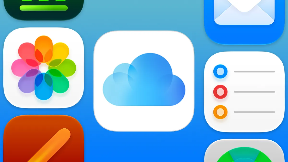
Apple has finally updated iCloud.com with its newer Liquid Glass icons, two years after introducing the new design language.
Those who have regularly visited the iCloud website in the past couple of years would have noticed the outdated feel of the app icons, which were last seen in iOS 18.
When Apple introduced its glassy operating system redesign at WWDC25 with iOS 26, the company updated all of its icons to incorporate a new glassy look.
However, these icons did not last, as Apple reworked the icons the following year for iOS 27, incorporating more glass elements directly into the icon artwork itself.
This is perhaps why the company put off updating iCloud.com for so long, and could signal to us that these icons are the ones Apple is sticking with for the next few years to come.
Here's a look at what's changed
Old iCloud icons:
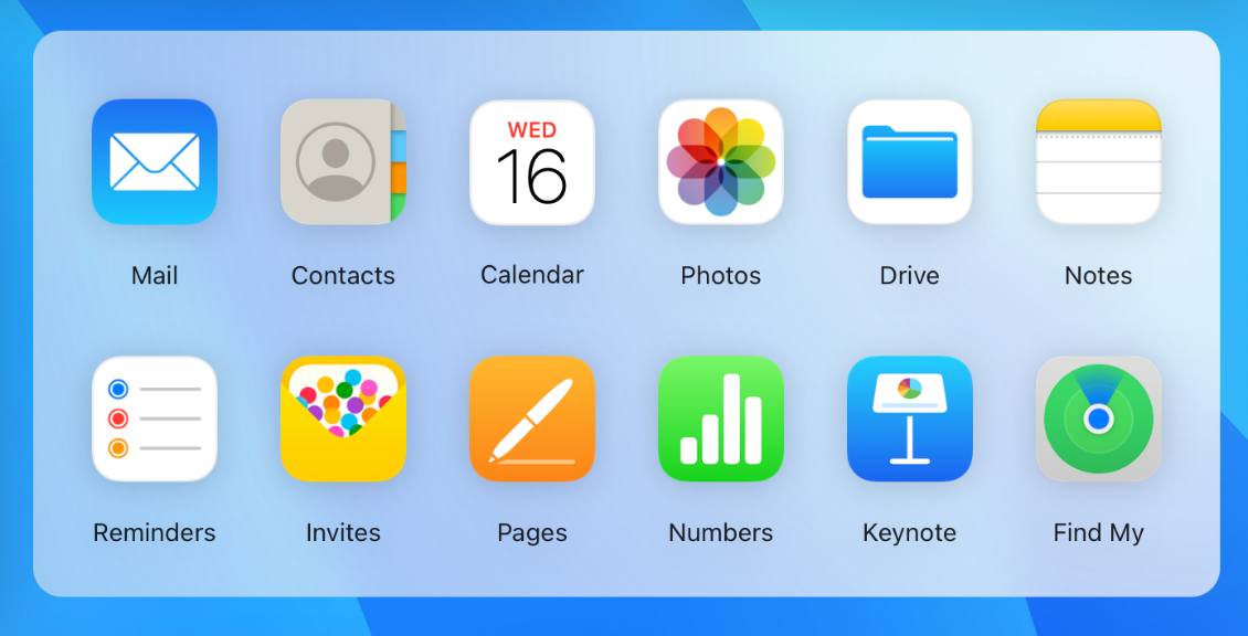
New iCloud icons:
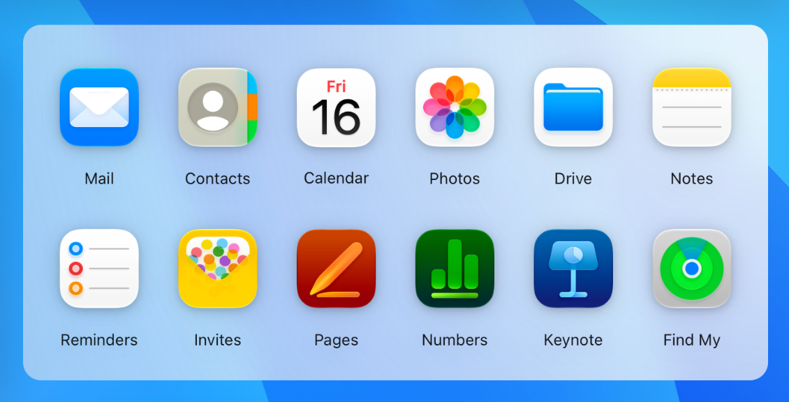
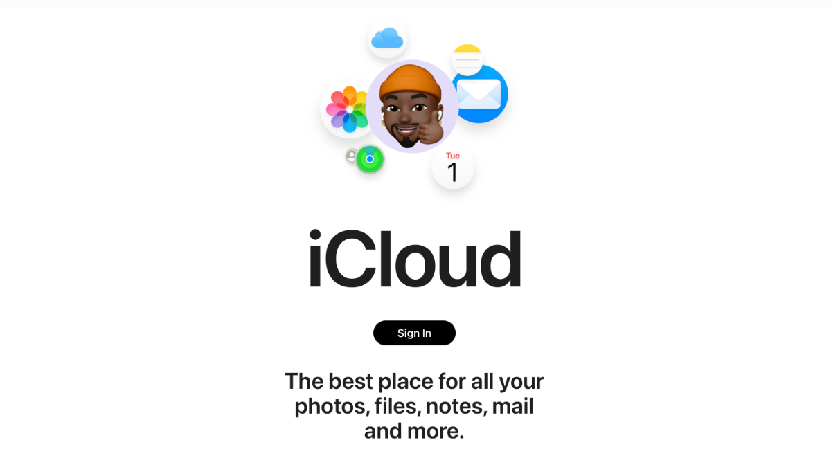
Additionally, the redesigned glassy icons have also made their way to the login page, which previously featured the older iOS 18 era icons.
Final Thoughts
This update finally brings iCloud.com's app icons in line with Apple's operating systems, unifying the icons under a consistent design language. It could also suggest that Apple is settling on its latest designs after several years of tweaks, including the Pages, Numbers and Keynote icons, which received their own redesigns earlier this year.
However, this doesn't suggest Apple has settled on all of its icons yet. Apple Music is currently undergoing a rebrand in the latest iOS betas, though this is not relevant to iCloud.com.