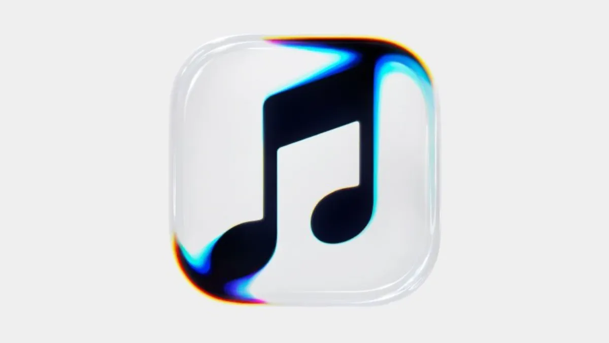
Apple Music has today unveiled a new look, after it introduced a new word mark with the launch of Apple Music Hall in late September, and a new app icon emerged in recent iOS beta releases. So what's changing, and how will the rebrand impact subscribers?
The Announcement
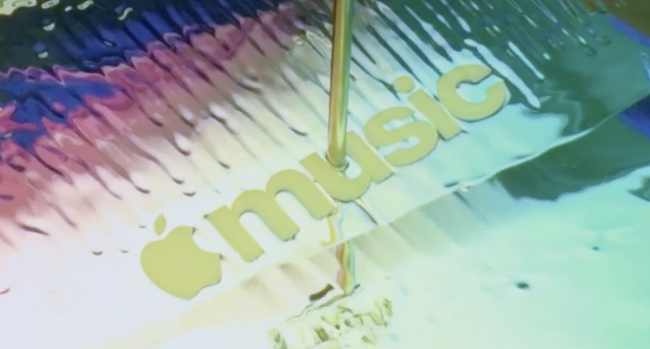
In a post on X, Apple Music said:
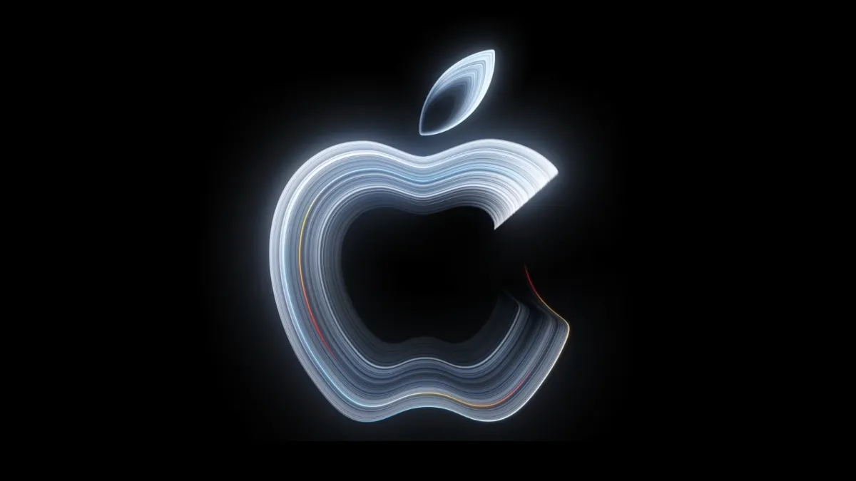
Introducing a new identity for Apple Music, physically shaped by an original composition from @fredagainagain1 and NEST Acoustics.
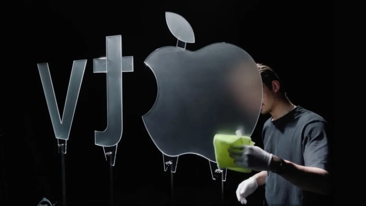
This essentially means that Apple used the frequencies and beats of music created by British producer Fred Again to form the glassy ripple-effect seen in the rebrands videos, word mark and icon, such as the new social media profile picture and account banner.
Therefore, the new look has been created by music itself, a nice little detail in what else could have been quite a bland rethink of the Apple Music brand.

This new glassy effect also ties the rebrand in with Apple's Liquid Glass design language, which made its debut in iOS 26 last year. Apple has slowly been updating its branding across the company to reflect this design, including the Apple TV rebrand from earlier in the year, recent iCloud.com updates with Liquid Glass and refined icons across it's operating systems.
Speaking about refined icons, the rebranded Apple Music icon has also made its way into the latest iOS betas, where Apple has ditched the iconic red accent colour it has used since 2015.
New App Icon
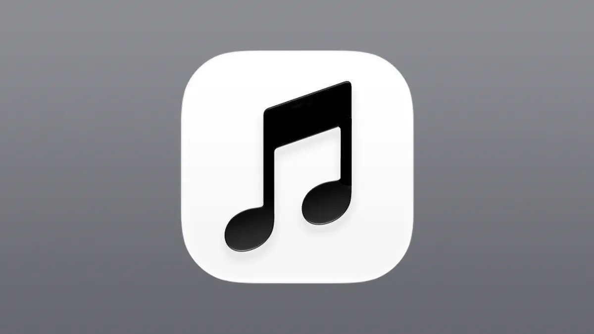
In the latest iOS 27.2 betas, which are due to release as soon as next week, the iconic red icon has been replaced with a simple black and white icon. In dark mode, the colours simply reverse themselves, and the icon can be tinted with any colour as usual.
This change was originally met with criticism, with some calling the new look 'miserable'.
However, with the additional context of the rebrand, the changes feel much more compelling.
With the red colour gone from the app logo, the red accent colour within the app has also been replaced by the default blue accent colour, which is found across other Apple apps and services, such as TV, Maps, Health and Photos.
Apple continues to prioritise human creativity
The world seems to be advancing forwards, head first into generative AI. All major technology companies, including Apple, are investing in and incorporating AI into their products and services.
In June at WWDC26, Apple's core focus was it's revamped Siri AI chatbot-like assistant, and the company has also made AI a big focus in it's latest software releases from AI photo editing tools and notification summaries, to AI assistants and image generation tools.
But, at the same time, Apple continues to portray human touch and creativity throughout the company.
Earlier this year, Apple TV+ got its glassy rebrand to Apple TV, where the company showcased that the new logo was made in a real studio, with real panels of glass.
In August, the new Mac mini advert was a stop-motion animation with clay figures, made by real artists.
Most recently in October, the logo of Apple's Welcome Home product launch was cross-stitched, with the announcement video shared on social media of two women creating the logo themselves by hand.
This shows Apple is actively trying to show it is still dedicated to creatives, which has always been a major focus for the company's since they introduced Final Cut Pro to the Mac in 1999, and music creation software Garage Band in 2004.
Impact on subscribers
I wouldn't expect much impact on existing Apple Music subscribers. Apple has shared no planned changes to the subscription, ad-free model, so you can keep enjoying your ad-free music for £11.99 a month.
The only difference will be that the app icon will look a little different on your Home Screen, and the distinctive red accent colours of the app will be replaced with blue.
This feels simply like a refresh to modernise the Apple Music brand, which has had the same visual identify for over a decade.