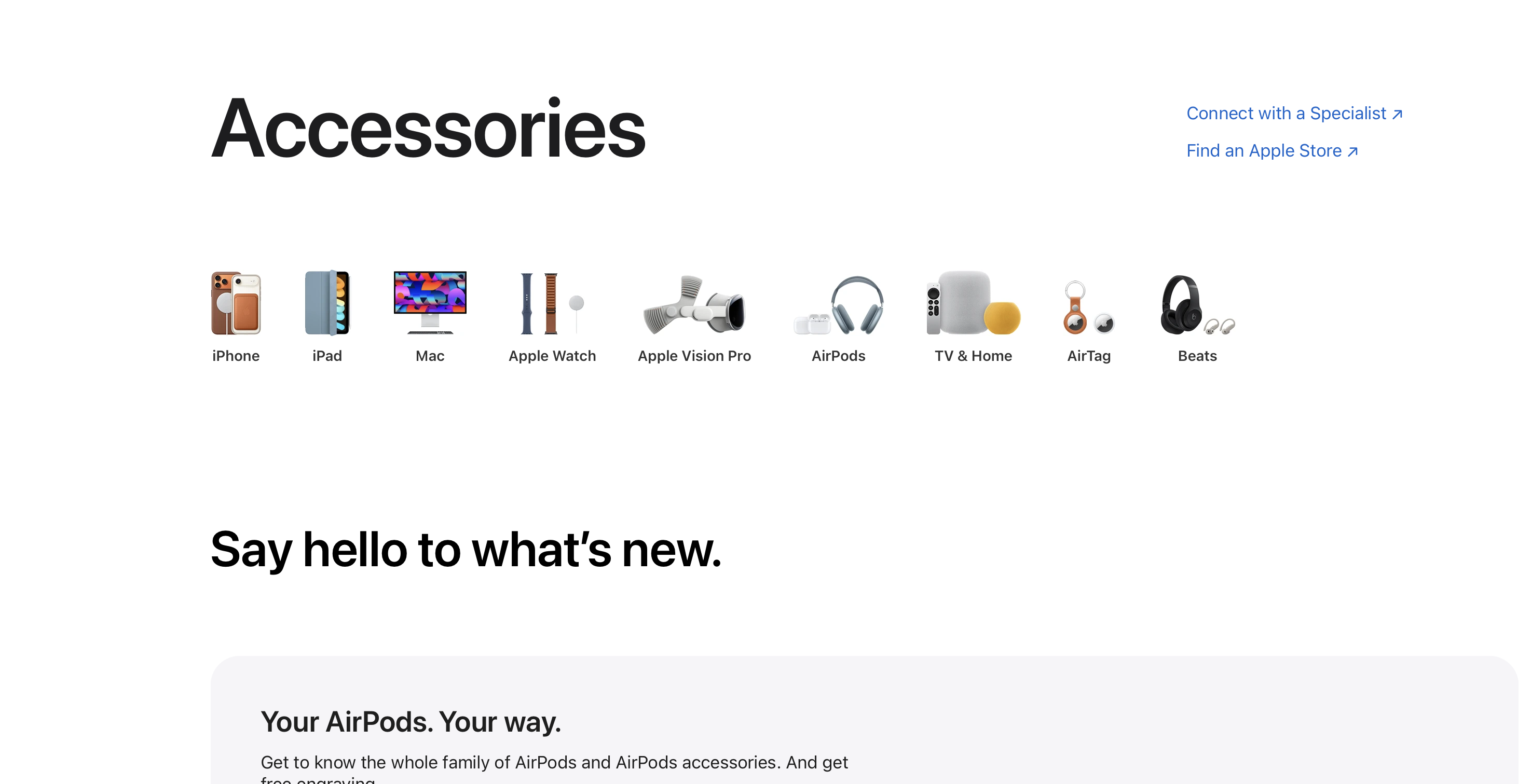
Apple has overhauled how you shop for accessories on its website, with a new landing page design that resembles its product pages such as iPhone, iPad and Mac.
The change, first spotted by 9to5Mac's Chance Miller, replaces the search-result style page with a carousel of Apple products that you can select to filter by that device.
The website now suggests accessories based on your bag, and has a feature grid of accessories to explore.
The new layout appears to be an attempt to provide suggestions to the customer of what they might like, rather than provide a search bar which only functions best when the user knows what they are looking for.
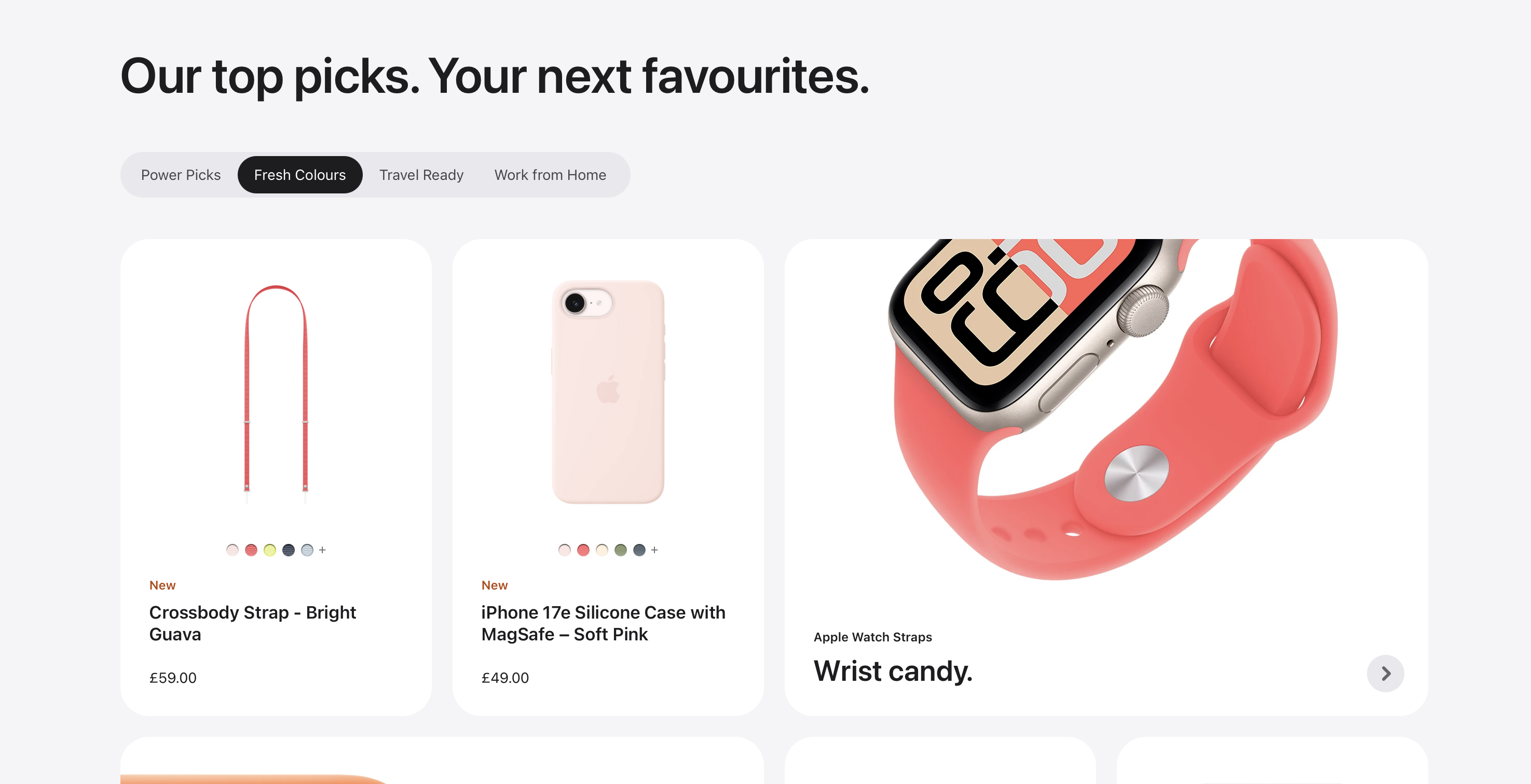
The change also applies to the Apple Store app, with a much more curated layout and option to filter by your Apple devices that are connected to your Apple Account.
It is unclear when Apple pushed this update to it's website and app, though wayback machine shows the old page layout was still present Friday night. This suggests the page was either refreshed today or over the weekend.
The Apple Store app was last updated 1 week ago, with no release notes mentioning this change.
Overall, the changes have unified the accessories page on Apple's website with its other product pages. Notably, the Watch, Home & TV and AirPods pages have not been refreshed to reflect Apple's new website design they launched late last year.